字体说明
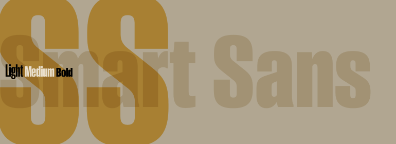
Smart Sans™
字体英文名称:AM297___.TTF

Smart Sans™
品牌:Monotype
设计师:
McDonald,Rod
发行时间:2018
字库编码:
Unicode
分类:
无衬线体
字体属性:
字体介绍
Smart Sans是对Leslie(Sam)Smart的个人致敬,这个人是加拿大一家主要的排印公司聘用的第一位字体总监。Smart是20世纪的设计先驱,他提高了加拿大排印的标准。他和他的三个同行一起在多伦多建立了第一个Type Directors Club。<br><br>
1998年Smart去世后,字体设计师Rod McDonald决定做点什么来纪念Smart的一生和成就。“我最初是想以Smart的名义设立一个奖学金,但是设计一款字体的想法很快就取代了这一想法,” Rod McDonald,“然而,当我决定设计一种字体时,它就变成了一个意料之中的结论,那就是它将是一种无衬线字体——没有其他原因,只是因为我喜欢Smart sans这个名字。” <br><br>
McDonald的创作灵感来自两种字体。“如同成千上万的设计师一样,我热衷于Matthew Carter的Helvetica Compressed家族。而且,当我年轻的时候,我也喜欢Fred Lambert的Compacta,” McDonald说,“我想,也许会有一个小范围的地方可以取代这些‘老主力’,并且在此过程中,能够给这个流派带来更新鲜的外观。”<br><br>
McDonald为Smart Sans家族绘制了三个字重,它们非常适合设置引人注目的标题以及功能强大的显示正文。双层的“g”使该设计活泼个性,而短短的“r”使字间距保持紧凑均衡。<br><br>
Smart Sans是对优秀的字体设计的致敬之作,因为它提高了人们对精简无衬线字体的期望,Sam Smart会很高兴的。”<br><br>
Smart Sans is a personal tribute to Leslie (Sam) Smart, the first type director to be hired by a major typesetting house in Canada. Smart was a twentieth century design pioneer who raised the standards of Canadian typography. Together with three of his peers, he established the first Type Directors Club in Toronto.
<br><br>
After Smart’s death in 1998, type designer Rod McDonald decided that something should be done to commemorate Smart’s life and achievements. I had first thought of establishing a scholarship in Sam’s name, but a typeface design soon replaced this idea," says McDonald. "Once I decided to design a typeface, however, it became a foregone conclusion that it would be a sans serif – for no other reason than that I loved the name Smart Sans."
<br><br>
Two typefaces served as inspiration for McDonald’s work. "Like thousands of designers, I’m keen on Matthew Carter’s Helvetica Compressed series. And, when I was younger, I also loved Fred Lambert’s Compacta," says McDonald. "I thought there might be a place for a small range that could take over from these ‘old workhorses’ and, in the process, bring a fresher look to the genre."
<br><br>
McDonald drew three weights for the Smart Sans family, all ideally suited for setting attention-getting headlines and powerful display copy. The two-storied ‘g’ contributes to the design’s lively personality, and the short ‘r’ helps maintain tight, even spacing.
<br><br>
Smart Sans is the perfect homage to a great typographer, because it raises the bar on what to expect from condensed sans serif typefaces. Sam Smart would be pleased."
