字体说明
ITC Avant Garde Gothic®
字体英文名称:ITCAvantGardeW1G-XLt.TTF

ITC Avant Garde Gothic®
品牌:ITC(Monotype)
设计师:
Lubalin,Herb; Carnase,Tom; Benguiat,Edward; Gürtler,André; Gschwind,Erich; Mengelt,Christian
发行时间:2016
字库编码:
Unicode
分类:
无衬线体
字体属性:
字体介绍
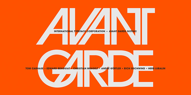
ITC Avant Garde Gothic®由Herb Lubalin和Tom Carnase于1970年设计。该字体基于Lubalin为Avant Garde Magazine设计的logo——重叠且设置紧凑的几何大写字母的结合。ITC Avant Garde是一种几何无衬线字体;也就是说其基本形状是由圆形和直线构成,非常类似于20世纪20年代德国Bauhaus运动的作品。早期版本的ITC Avant Garde以其众多独特的替换字形和连字而闻名,这些字体仍然让人想起20世纪70年代的排印风格。这些字体包含基本字母(不包含不常见的老式连字)。ITC Avant Garde仍然强健而现代,已成为当今平面设计师的必备品。大而开放的字怀、x字高较高使其看起来很友好,也使得该字体家族更适用于短文和标题。窄体字重由Ed Benguiat于1974年绘制,斜体由André Gürtler、Erich Gschwind和Christian Mengelt于1977年设计。ITC Avant Garde® Mono是由Ned Bunnel于1983年完成的等宽版本。
<br><br>
ITC Avant Garde Gothic® was designed by Herb Lubalin and Tom Carnase in 1970. They based it on Lubalin´s logo for Avant Garde Magazine – an exciting construction of overlapping and tightly-set geometric capitals. ITC Avant Garde is a geometric sans serif; meaning the basic shapes are constructed from circles and straight lines, much like the work from the 1920s German Bauhaus movement. The early versions of ITC Avant Garde became well-known for their many unique alternates and ligatures that still conjure up the typographic aura of the 1970s. These fonts contain the basic alphabets (without the old unusual ligatures). Still strong and modern looking, ITC Avant Garde has become a solid staple in the repertoire of today’s graphic designer. The large, open counters and tall x-heights seem friendly, and help to make this family work well for short texts and headlines. The condensed weights were drawn by Ed Benguiat in 1974, and the obliques were designed by André Gürtler, Erich Gschwind and Christian Mengelt in 1977. ITC Avant Garde® Mono is a monospaced version done by Ned Bunnel in 1983.
