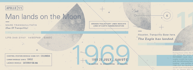
字体说明
Univers®
字体英文名称:UniversLTPro-ThinUltCond.TTF

Univers®
品牌:Linotype(Monotype)
设计师:
Frutiger,Adrian
发行时间:2016
字库编码:
Unicode
分类:
字体属性:
字体介绍
Univers字体家族是20世纪下半叶最伟大的排印成就之一。这个家族的优势是有各种各样的字重和风格,即使结合起来使用,也会给人一种稳定和同质的印象。Univers清晰、客观的字形使其成为一款几乎适用于任何印刷需要的可读性高的字体。1954年,法国字体铸造厂Deberny & Peignot希望在Lumitype字体范围内增加一个线性无衬线字体和它的几个字重。铸造厂的艺术总监Adrian Frutiger建议不要改变现有的字母系统。他想做一款新的字体,最重要的是,这款字体要适用于较长文本的排印——这在当时对于无衬线字体来说是一个极其令人振奋的挑战。Frutiger从他在苏黎世应用艺术学院学生时代的旧笔稿着手,创作了Univers字体家族。该字体家族于1957年由Deberny & Piegnot发行,之后由Linotype生产。Deberny & Peignot字库于1972年被Haas收购,而Haas’sche Schriftgiesserei (Haas Type Foundry)于1985/1989年被并入D. Stempel AG/Linotype collection。直到今天,Adrian Frutiger一直使用Linotype进行设计工作。1997年,Frutiger和Linotype的设计人员完成了一个大型的联合项目,他们对Univers字体家族进行了彻底的复刻和更新。结果就是:Univers Next——提供59个字重和4个Linotype Univers打字机字重。Univers强健、清晰的字形有利于表达其冷静优雅和理性能力的风格。<br>
Univers有一种神奇的能力,它可以很好地结合许多不同风格和由来的字体:<br>
老式字体如:Janson Text, Meridien, Sabon, Wilke。<br>
强调现代感的字体,如: Linotype Centennial, Walbaum。<br>
粗衬线字体,如:Egyptienne F, Serifa。<br>
书写体和笔刷体如: Brush Script, Mistral, Ruling Script。<br>
哥特体如: Duc De Berry, Grace, San Marco。<br>
甚至有趣的字体,如:F2F OCRAlexczyk, Linotype Red Babe, Linotype Seven。<br><br>
The font family Univers? is one of the greatest typographic achievements of the second half of the 20th century. The family has the advantage of having a variety of weights and styles, which, even when combined, give an impression of steadiness and homogeneity. The clear, objective forms of Univers make this a legible font suitable for almost any typographic need. In 1954 the French type foundry Deberny & Peignot wanted to add a linear sans serif type in several weights to the range of the Lumitype fonts. Adrian Frutiger, the foundry’s art director, suggested refraining from adapting an existing alphabet. He wanted to instead make a new font that would, above all, be suitable for the typesetting of longer texts – quite an exciting challenge for a sans-serif font at that time. Starting with his old sketches from his student days at the School for the Applied Arts in Zurich, he created the Univers type family. In 1957, the family was released by Deberny & Piegnot, and afterwards, it was produced by Linotype. The Deberny & Peignot type library was acquired in 1972 by Haas, and the Haas’sche Schriftgiesserei (Haas Type Foundry) was folded into the D. Stempel AG/Linotype collection in 1985/1989. Adrian Frutiger continues to do design work with Linotype right up to the present day. In 1997, Frutiger and the design staff at Linotype completed a large joint project of completely re-designing and updating the Univers family. The result: Univers Next – available with 59 weights and 4 Linotype Univers Typewriter weights. With its sturdy, clean forms Univers can facilitate an expression of cool elegance and rational competence.<br>
Univers has the uncanny ability to combine well with fonts of many different styles and origins:<br>
Old style fonts such as: Janson Text, Meridien, Sabon, Wilke.<br>
Modern-stressed fonts such as: Linotype Centennial, Walbaum.<br>
Slab serif fonts such as Egyptienne F, Serifa.<br>
Script and brush fonts such as: Brush Script, Mistral, Ruling Script.<br>
Blackletter fonts such as: Duc De Berry, Grace, San Marco.<br>
Even fun fonts such as F2F OCRAlexczyk, Linotype Red Babe, Linotype Seven."
