字体说明
Glypha®
字体英文名称:GlyphaLTPro-Thin.TTF

Glypha®
品牌:Linotype(Monotype)
设计师:
Frutiger,Adrian
发行时间:2018
字库编码:
Unicode
分类:
字体属性:
字体介绍
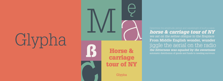
Glypha是1977年由Adrian Frutiger设计,是他在20世纪60年代设计的粗衬线字体Serifa的延申窄体版。与Serifa一样,Glypha也是基于Univers的基本形式建模的,并添加了粗衬线。Glypha具有比Serifa更高的x字高,其曲线的比例是基于椭圆的。这个字体家族非常易读且实用,这10个粗细之间的细微差别为平面设计师提供了多种应用可能性。对于目录、广告和杂志作品来说,Glypha是个特别好的选择。
<br>
Glypha™ was designed in 1977 by Adrian Frutiger, and is the condensed extension of Serifa, his slab serif (or Egyptian) design from the 1960s. Like Serifa, Glypha is modeled from the basic forms of Univers, with the addition of slab serifs. Glypha has a taller x-height than Serifa, and the proportions of its curves are based on the oval. This family is wonderfully legible and practical, and the fine differentiation between the ten weights offers the graphic designer a variety of application possibilities. Glypha is a particularly good choice for catalogues, advertisements, and magazine work."
