字体说明
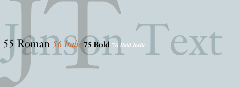
Janson® Text
字体英文名称:JansonTextLTPro-Roman.TTF

Janson® Text
品牌:Linotype(Monotype)
设计师:
D. Stempel AG Design Studio
发行时间:2018
字库编码:
Unicode
分类:
字体属性:
字体介绍
匈牙利雕刻师Miklos Kis大约于1685年在阿姆斯特丹工作时设计和切割了这款字体。它并不是由在莱比锡工作的荷兰人Anton Janson切割的。多年来,该字体被误认为是Janson创作的,而且字体名称也仍然错误地使用着他的名字。1919年,Kis的一些凸模和凹模(punches and matrices)流入到法兰克福的D. Stempel AG公司。1954年,Linotype Janson是基于原始Kis的凸模,在Hermann Zapf的监督下被切割。D. Stempel AG Design Studio的Werner Schimpf和Reinhard Haus与内部设计师合作,于1985年对Janson进行了最新扩展。如今这个版本的Janson Text已经成为一个包含八种字重的通用字体家族,是Kis最真实的数字版本。凭借其清晰、坚固的形式以及强烈的笔画对比,Janson Text已被证明非常适用于书籍和杂志中的文本,并且继续并继续出现在畅销字体的行列。<br><br>
The Hungarian punchcutter Miklos Kis designed and cut this typeface in about 1685 while working in Amsterdam. It was not cut by Anton Janson, a Dutch punchcutter who worked in Leipzig in the seventeenth century. For many years this typeface was wrongly attributed to Janson, and the font still erroneously bears his name. Some of the Kis punches and matrices made their way to D. Stempel AG in Frankfurt in 1919. Linotype Janson was cut in 1954 under the supervision of Hermann Zapf, and was based on the original Kis punches. Werner Schimpf and Reinhard Haus from the D. Stempel AG Design Studio worked together with the internal designers the most recent expansion of Janson in 1985. Now a versatile family of eight weights, this version of Janson Text is the most authentic digital version of the Kis types. With its legible, sturdy forms and strong stroke contrast, Janson Text? has proved very successful for book and magazine text, and it continues to appear in the ranks of bestselling types.

