字体说明
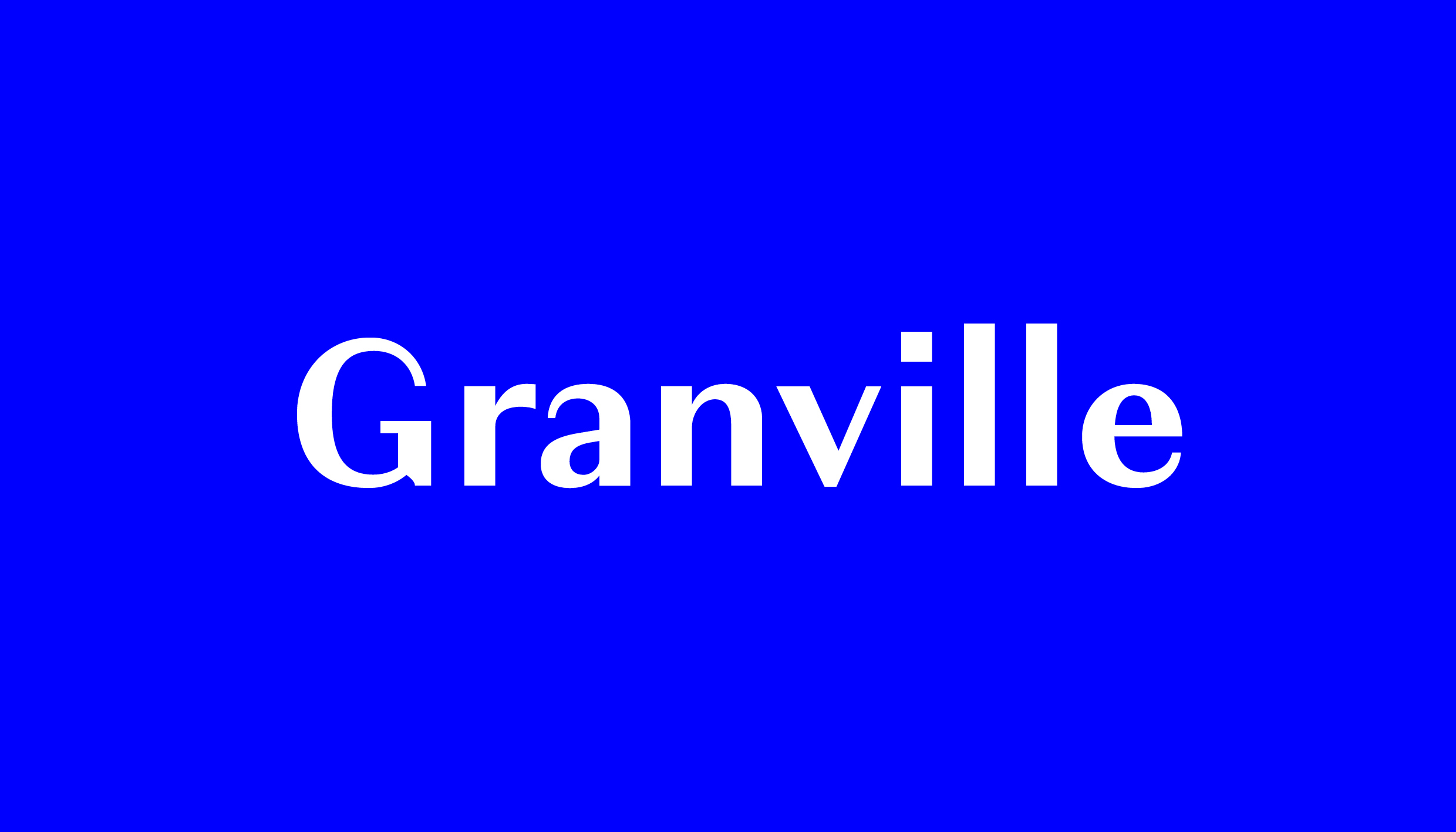
Granville
字体英文名称:Granville-Light.TTF

Granville
品牌:Production Type
设计师:
Jean-Baptiste Levée
发行时间:2018
字库编码:
Unicode
分类:
字体属性:
心动字
字体介绍
The modulated sans serif — that is, a sans with visible contrast between thick and thin strokes — was once a mainstay of signs and posters, as well as advertising text during the mid 20th century. These faces lost their appeal with the rise of Modernism and were rarely seen over the last 40 years, but Jean‑Baptiste Levée rediscovered their charisma for his latest release. Granville is a reinterpretation of the thick-thin style, built with a rational construction like the early French Moderns, yet without a tie to any specific period or model. This concept brings to mind the classic charmer Peignot, but Granville’s character isn’t derived from eccentric letterforms, but subtle details instead, making it a much more adaptable design. The family range was planned for versatility as well. Unlike most typefaces in this genre, Granville is sufficiently sturdy for text setting, despite its elegant contrast. A Granville Display variant, with the relatively delicate hairlines and narrow stature of a titling face, is available.
In its italic Granville radiates a muted calligraphic tone yielded from the flexibility of the pointed pen. Strokes gently turn and swell. Small tails curl upward. This italic has a distinct personality of its own, but never departs too far from its roman counterpart. The 6-font family has all the debonair refinement of an old modulated sans, without its antiquated baggage.
