字体说明
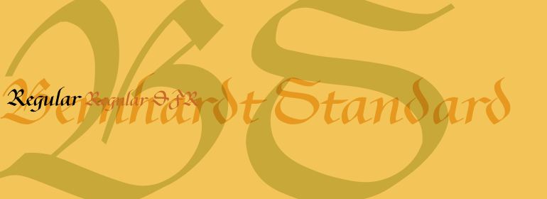
Bernhardt Standard™
字体英文名称:BernhardtStandardCom.TTF

Bernhardt Standard™
品牌:Linotype(Monotype)
设计师:
Goede,Julius de
发行时间:2018
字库编码:
Unicode
分类:
字体属性:
字体介绍
2003年由Julius de Goede设计的Bernhardt Standard™是一个流畅的Bastarde手写体。Bastarde是黑体字的子类别之一。“Blackletter”一词指的是由北欧中世纪手稿传统演变而来的字体。这些字母通常被称为哥特字母或古英语字母,它们的形状中带有宽尖笔触的痕迹。在各种各样的黑体字风格中,Bastarde手写体是最流畅的,或者说最斜体的。第一个Bastarde字体,在15世纪晚期被切割,是基于法国手写风格,特别是那些在Burgundy流行的风格。<br><br>
Bernhardt Standard的流畅性使得它与其他字体的黑体字相似。<br><br>Bernhardt Standard,由于其手写的根源,也类似于Kurrent,一种20世纪前在德国流行的手写风格。Bernhardt Standard是一个非常书法的字型,适合正式应用。这种字体是证书或奖项的最佳选择。字体中的老式数字也适用于很短的文本。<br><br>
Bernhardt Standard, which was designed in 2003 by Julius de Goede, is a flowing Bastarde script. Bastarde is one of the sub-categories of Blackletter typefaces. The term Blackletter refers to typefaces that have evolved out of Northern Europe’s medieval manuscript tradition. Often called gothic, or Old English, these letters are identifiable by the traces of the wide-nibbed pen stroke within their forms. Of all of the various sorts of Blackletter styles, Bastarde scripts are the most flowing, or Italic. The first Bastarde typefaces, cut in the late 1400s, were based off of French handwriting styles, especially those styles popular in Burgundy. <br><br>
The flowing nature of Bernhardt Standard makes it similar to some other sorts of Blackletter typefaces as well. Bernhardt Standard, because of its handwritten roots, is also similar to Kurrent, a style of handwriting that was popular in Germany prior the 20th Century.
<br><br>
Bernhardt Standard is a very calligraphic face, suitable for formal applications. This typeface would be an excellent choice for certificates or awards. The old style figures in the font allow for nice short settings of text as well.
