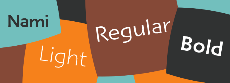
字体说明
Nami®
字体英文名称:NamiCom-Light.TTF

Nami®
品牌:Linotype(Monotype)
设计师:
Frutiger,Adrian; Kobayashi,Akira
发行时间:2018
字库编码:
Unicode
分类:
无衬线体、正文字体
字体属性:
字体介绍
Nami,日语中的“wave”的意思,是Adrian Frutiger与Linotype字体总监小林章(Akira Kobayashi)的最新合作。这种字体家族是Adrian Frutiger有史以来最具人文主义的无衬线设计,它有一个有趣的转变:lapidary的替代字符可以在OpenType-savy应用的帮助下进行浏览。Adrian Frutiger在20世纪80年代就开始了这一设计,后来发展为Nami。尽管它没有在20世纪生产,但它是一种非常超前的想法。该字体包括几个看起来很前卫的替代字符;这些是常见的字母形式的“lapidary”版本。2006年,当小林章(Akira Kobayashi)重新设计该项目时,他把这个概念重新设计为一个包含三种字体的家族。每种字体包含483种字形,包括11种变体——小写g的两种额外形式,以及a、e、h、l、m、n、r、t和u的新形式。”。<br><br>
Nami, the Japanese word for wave," is the latest collaboration between Adrian Frutiger and Linotype’s Type Director, Akira Kobayashi. This typeface family is the most humanistic sans serif design ever to come from Adrian Frutiger, and it has an interesting twist: lapidar alternates that may be surfed through with the help of OpenType-savy applications. Adrian Frutiger began the design that would blossom into Nami during the 1980s. Although it would not be produced during the 20th century, it was quite forward thinking. The typeface included several seemingly avant garde alternates; these were "lapidary" versions of common letterforms. Revisiting the project in 2006, Akira Kobayashi reworked the concept into a working family of three typefaces. Each font contains 483 glyphs, including 11 alternates-two extra forms of the lowercase g, as well as new forms for a, e, h, l, m, n, r, t, and u."
