字体说明
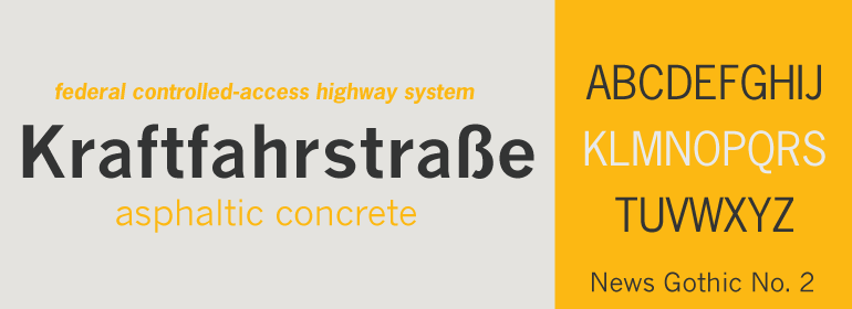
News Gothic™ No. 2
字体英文名称:NewsGothicCom-Thin.TTF

News Gothic™ No. 2
品牌:Linotype(Monotype)
设计师:
Benton,Morris Fuller
发行时间:2018
字库编码:
Unicode
分类:
无衬线体
字体属性:
字体介绍
News Gothic No. 2是D. Stempel AG字体铸造厂于1984年制作的一个News Gothic的增强版本。与其他版本相比, News Gothic家族增加了更多的字重,提高了其在当代设计和传播中的使用。<br>
较细字重的初原版News Gothic是由Morris Fuller Benton在1908年为American Typefounders(ATF)设计的。News Gothic字体与Benton在20世纪初设计的其他无衬线字体非常相似,包括Franklin Gothic 和Lightline Gothic。粗体字重于1958年加入到News Gothic方案中。<br>
News Gothic No. 2号的大写字母与News Gothic的大写字母具有相似的视觉宽度。小写字母紧凑而强大。这些设计属性有助于Benton完全掌控无衬线字体,多年来,他的字体一直为报纸头条和许多其他用途所欢迎。News Gothic在字体排行榜上仍然很受欢迎,它已经证明了自己很出色。
<br><br>
News Gothic No. 2 is an enhanced version of News Gothic produced by the D. Stempel AG type foundry in 1984. It added more weights to the News Gothic family than were available in other versions, increasing its use in contemporary design and communication.
<br>
The lighter weights of the original News Gothic were designed by Morris Fuller Benton in 1908 for American Typefounders (ATF). News Gothic typeface is quite similar to Benton’s other sans serifs from the early twentieth century, including Franklin Gothic and Lightline Gothic. The bold weights were added to the News Gothic scheme in 1958.
<br>
The capital letters in News Gothic No. 2, just like those found in News Gothic, have a similar visual width to each other. The lowercase is compact and powerful. These design attributes contributed to Benton’s strong handle on the sans serif genre, and for years his types have been popular for newspaper headlines and many other uses. Still a popular presence on the font charts, News Gothic has proven its ability to get the job done right.
