字体说明
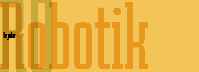
Robotik™
字体英文名称:lt_70384.TTF

Robotik™
品牌:ITC(Monotype)
设计师:
Quay,David
发行时间:2018
字库编码:
Unicode
分类:
衬线体
字体属性:
字体介绍
极其细窄的Robotik由英国字体设计师David Quai创作,并于1989年由ITC推出。这些图形强健有力,且紧凑,以及有着条状的线条。该字符形状纤细、狭窄且棱角分明,显示出机械般的精确性和出色的间距。相似的字形也让人想到机械装置,字母构成了文字链。字形的建构原理与第一次世界大战后的莫斯科建构主义相似。Robotik最适合用于大字号的标题。<br><br>
The extremely narrow Robotik was created by the British typeface designer David Quai and appeared with ITC in 1989. The figures are robust and strong and form tightly packed, bar-like lines. The characters’ slim, narrow and angular forms suggest mechanical exactness and cool distance. The similarity of the forms are also reminiscent of machinery and the letters form chains of words. The form principle shows parallels with the constructivism of Moscow after the First World War. Robotik is best used for headlines in large point sizes.
