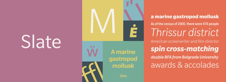
字体说明
Slate™
字体英文名称:MT367___.TTF

Slate™
品牌:Monotype
设计师:
McDonald,Rod
发行时间:2018
字库编码:
Unicode
分类:
无衬线体、正文字体
字体属性:
字体介绍
The Slate typeface family melds superb functionality and aesthetic elegance into a remarkable communications tool. Few typefaces possess the beauty and power of this design.Slate is the work of Rod McDonald, an award-winning typeface designer and lettering artist. At one point in his forty-year career, McDonald participated in a typeface legibility and readability research project conducted by the Canadian National Institute for the Blind (CNIB). There, McDonald learned which design traits were best suited to maximizing character legibility and text readability.
Shortly after his work with CNIB, McDonald was commissioned to design a large sans serif typeface family for Toronto Life magazine. Although not meant to be a legibility face,” the design gave McDonald an opportunity to test several of the theories he formed during the CNIB project. Around the same time, McDonald also developed a sans serif family for Nova Scotia College of Art and Design in Halifax. This typeface was primarily intended for use on the college’s web site.
McDonald was pleased with both designs, he says, but craved further exploration. “I felt that I had only scratched the surface of what I wanted in a sans,” he says. “I liked the soft, quiet look of the magazine face but was also encouraged by my success in drawing a good legibility design for on-screen use.”
“One of the things I wanted was a type that could function as well in print as on-screen,” McDonald recalls. To help achieve his goal, McDonald worked with the Microsoft Typography Team to learn about ClearType technology. ClearType was developed by Microsoft to improve the readability of on-screen text, especially on liquid crystal displays (such as laptop screens), flat panel monitors and mobile device displays.
McDonald’s technological savvy and prior work on sans serifs for print and on-screen use have paid off magnificently in the Slate family of typefaces. Slate blends features of McDonald’s earlier sans serifs into a humanistic sans with extraordinary levels of legibility.”Although it’s far too early to know if what I wanted works across the board,” says McDonald, “initial testing in both print and on the web are quite positive.”
In purely aesthetic terms, Slate is a beautiful design. “I didn’t want a face with an ‘engineered’ look, or with any noticeable design gimmicks or devices, says McDonald. “I wanted a pure design. I confess that I was ruthless with any character that wanted to stand out from the rest.””
