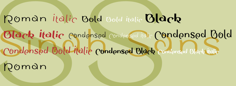
字体说明
Sinah™ Sans
字体英文名称:SinahSansCom-Roman.TTF

Sinah™ Sans
品牌:Linotype(Monotype)
设计师:
Huschka,Peter
发行时间:2018
字库编码:
Unicode
分类:
字体属性:
字体介绍
Peter Huschka developed the Sinah type family in 1994. The family consists out of two sub-sections: Sinah and Linotype Sinah Sans. The Sinah typeface has three weights: Regular Bold, and Black. Linotype Sinah Sans also has three weights: Regular, Bold, and Black; but each weight has four versions – Regular, Italic, Condensed, and Condensed Italic. In total, there are 15 Sinah fonts.
The basic concept behind the Sinah type family may be seen in the three Sinah fonts (which could aptly be named Sinah Serif). Here, Huschka created letterforms that each revolve around a central point. This central point is clearly marked in the three Sinah fonts by a ball terminal (in the 12 Linotype Sinah Sans fonts, have had this terminal removed to accentuate the sans serif appearance). Since Sinah’s letters spiral out from their centers’, some letters that normally no not have descenders extend below the baseline, strengthening the type’s overall design. These letters include: c, e, k, l, s, and t. This formal fluctuation makes text set in Sinah more uneaven than normal; Sinah’s letters dance across the line of text. One consequence of this is that Sinah is particularly legible when a line of text is exceedingly long.
With its extra descenders, Sinah has a feeling similar to many Asian scripts. Sinah should be used for decorative or display purposes, in sizes of at least 12 points or larger. The complete Sinah type family is part of the Take Type 2.1 collection, selected from the contestants of Linotype’s International Type Design Contests from 1994 and 1997.”
